AUDUSD Today – Tuesday, March 11, 2026: 1-Hour Chart Analysis Shows Change of Character Near 0.71750
Wed Mar 11 2026
More analysis for this pair:
View all AUDUSD market analysis →Forex forecast for this pair:
View AUDUSD forecast →Market Context
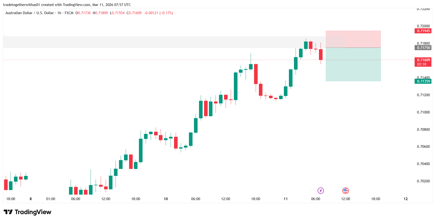
The Australian Dollar / US Dollar (AUD/USD) pair recently extended its bullish momentum before encountering resistance within a notable structural zone. After a strong upward move, price began showing early signs of exhaustion near the upper range.
The current chart highlights how price reacted within a defined technical area, followed by a shift in short-term market structure. Such developments often attract attention from market participants studying potential momentum transitions.
Higher Timeframe Structure Overview
On the 1-hour timeframe, AUD/USD had been maintaining a clear sequence of higher highs and higher lows, indicating a short-term bullish trend.
Price steadily advanced through multiple impulsive legs, suggesting strong buying pressure during the move. However, as price approached the 0.71800–0.71900 region, the bullish momentum began to weaken.
Key observations from the higher timeframe structure include:
- Sustained bullish market structure leading into the zone.
- Price reaching a previously reactive area.
- Signs of slowing momentum near the top of the move.
When markets approach such areas after an extended trend, participants often monitor for liquidity reactions, momentum shifts, or structural breaks.
Current Chart Structure and Momentum Shift
Within the highlighted zone, price initially showed hesitation before moving lower. When the chart is examined on the 5-minute timeframe, the internal structure reveals a notable Change of Character (ChoCh).
This structural shift occurs when price breaks a previous higher-low structure that had supported the bullish trend.
Key developments visible in the chart:
- Price approached the marked structural zone near 0.71750.
- Momentum began weakening after rejection from the higher area.
- A short-term Change of Character appeared on the lower timeframe.
- Price subsequently started forming lower highs and lower lows.
This sequence suggests that short-term momentum may have transitioned from bullish continuation to corrective or rotational behavior.
Educational Breakdown of the Marked Zones
The chart contains several highlighted areas intended for structural discussion.
Entry Area – Around 0.71750
The 0.71750 level lies within a previously active price region where liquidity and reactions occurred.
From a structural perspective, such areas often represent:
- Prior order flow concentration
- Retest of imbalance zones
- Reaction points after impulsive moves
The chart shows price revisiting this area before displaying signs of structural transition.
Risk Zone – Upper Structural Area
The upper shaded zone above the entry represents the region where price previously rejected.
From an analytical standpoint, this region reflects:
- The upper boundary of the recent impulse
- Potential liquidity above recent highs
- A technical invalidation region if upward momentum resumes
Zones like this help illustrate how traders frame market structure rather than acting as instructions.
Target Area – Lower Liquidity Region
The lower green zone represents a potential area where price could encounter liquidity or support if downward momentum continues.
Such zones typically correspond to:
- Previous consolidation ranges
- Liquidity pools beneath short-term lows
- Areas where market participants may reassess momentum
Alternative Market Scenarios
Financial markets rarely follow a single path. Several scenarios may develop from the current structure.
Scenario 1: Downside Continuation
If the newly formed lower timeframe bearish structure persists, price may gradually explore lower liquidity zones beneath the current range.
This would confirm that the recent move was more than a simple pullback.
Scenario 2: Structural Invalidation
If price reclaims the upper structural zone and forms new higher highs, the recent momentum shift could prove temporary.
In that case, the broader bullish trend may reassert itself.
Scenario 3: Range Development
Another possibility is that AUD/USD enters a consolidation phase between the upper and lower zones.
This type of environment typically forms after strong trends when the market redistributes liquidity before the next directional move.
What Market Participants May Watch Next
Several technical elements may guide future observations:
- Whether price maintains lower highs on lower timeframes
- Reactions near the 0.71750 structural region
- Liquidity sweeps above recent highs
- Momentum behavior near the lower highlighted area
Monitoring these dynamics helps analysts understand how market structure evolves over time.
Learning Takeaway
Regardless of the outcome, this chart illustrates an important technical lesson:
Strong trends can experience structural shifts when price revisits key zones.
By observing:
- Order flow reactions
- Change of Character signals
- Retests of imbalance areas
market participants can better understand how trend transitions often begin on lower timeframes before appearing on higher ones.
Explore more analysis from this trading session:
View all london Session Analysis →Explore more forex forecasts and market outlooks:
View Forex Forecast Hub →Forex forecast for this session:
View AUDUSD london Session Forecast →
Written by
Trade Together Research
Trade Together Research is a professional market analysis team providing forex, gold, and crypto trading insights, technical analysis, and educational guides.. Learn more about our research team on the About page.