How to Read Candlestick Charts for Beginners: Bullish and Bearish Candles Explained (Chapter 8 – Part 1)
Wed Mar 11 2026
Introduction: Moving from Theory to Practical Trading
In the earlier chapters of this course, we focused mainly on the theoretical side of forex trading.
For example, in Chapter 1 we studied what Forex is and how currency pairs work 🔗https://tradetogether.in/articles/forex-course-for-beginners-chapter-1-what-is-forex-and-how-currency-pairs-work , and in Chapter 2 we learned how trading works inside a trading account including margin, leverage, and risk 🔗https://tradetogether.in/articles/forex-trading-mechanics-lots-leverage-margin-explained .
Those chapters helped us understand how the forex market functions.
Now we are entering the practical side of trading.
To understand what is happening in the market in real time, traders need a way to see price movement clearly. This is where charts become very important.
Professional traders, banks, and institutions do not analyze the market by looking at random numbers. Instead, they study price movement visually using charts.
In this chapter, we will start learning the foundation of chart reading, which is one of the most important skills in trading.
What You Will Learn in This Chapter
In this chapter, you will learn the basic foundation of reading price charts.
By the end of this lesson, you will understand:
- What a chart is and why traders use charts
- Different types of charts used in financial markets
- Why charts are important in forex trading
- Why most traders prefer candlestick charts
- What a candle represents in a price chart
- The difference between bullish and bearish candles
These concepts form the foundation of price action analysis, which will help you understand more advanced candlestick patterns in the next parts of this chapter.
What is a Chart?
A chart is a visual way to represent data.
Instead of reading a long list of numbers, charts help us see patterns and changes easily.
For example, imagine you want to see how the temperature of a city changed during the last week.
You could read numbers like:
25°C, 27°C, 29°C, 30°C...
But when these numbers are displayed on a chart, you can instantly see how the temperature moved up or down over time.
The same idea is used in financial markets.
In trading, a chart shows how the price of an asset changes over time.
Traders use charts to understand:
- Whether the price is moving up or down
- Where buyers or sellers may be active
- How the market behaved in the past
Charts allow traders to visually observe price movement and market behavior.
Different Types of Charts
Charts are used in many areas such as business, research, education, and financial markets.
Some common types of charts include:
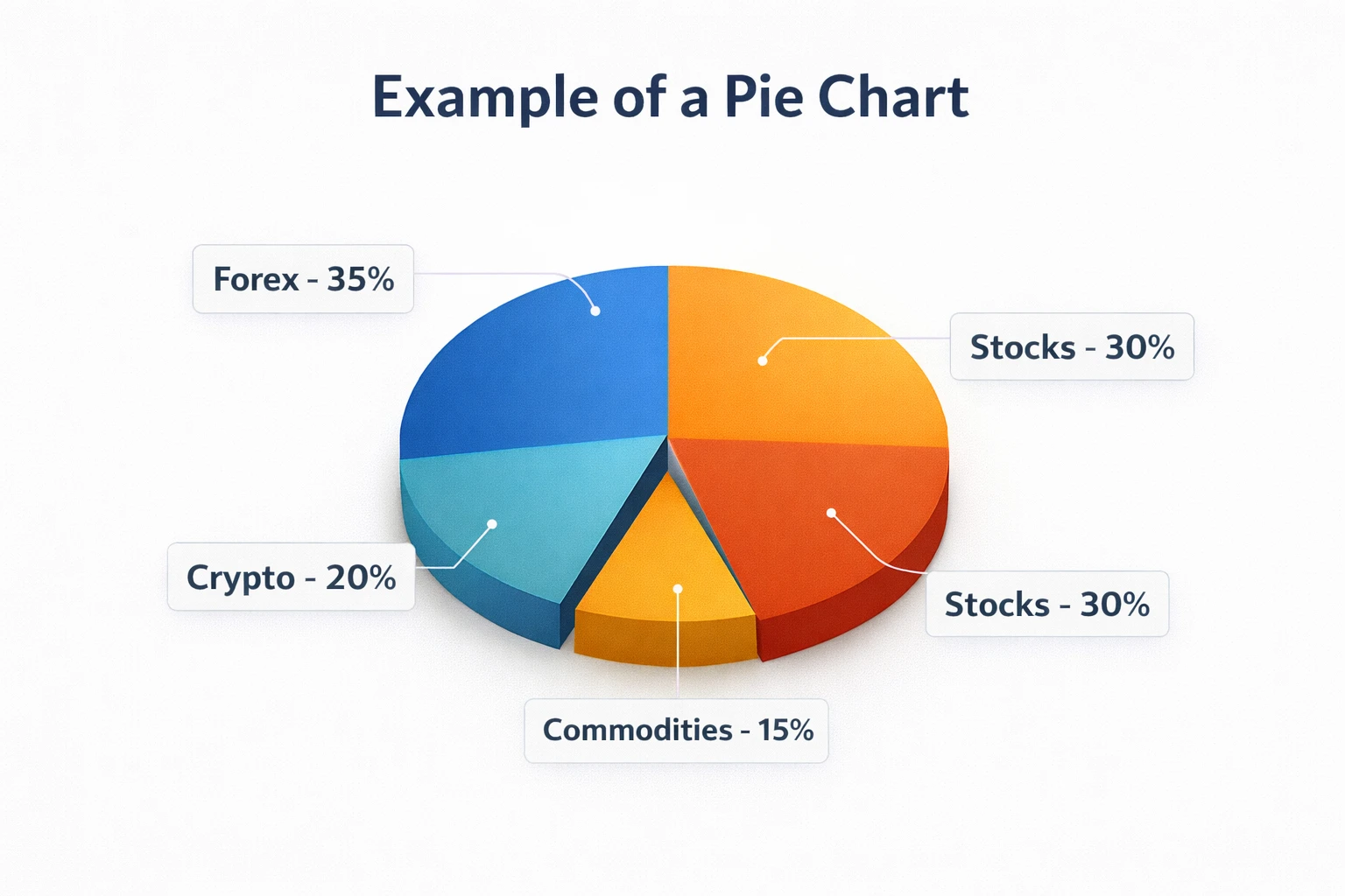
Pie Chart
A pie chart is used to show percentages or proportions.
For example, a company may use a pie chart to show how its total budget is divided between marketing, salaries, and operations.
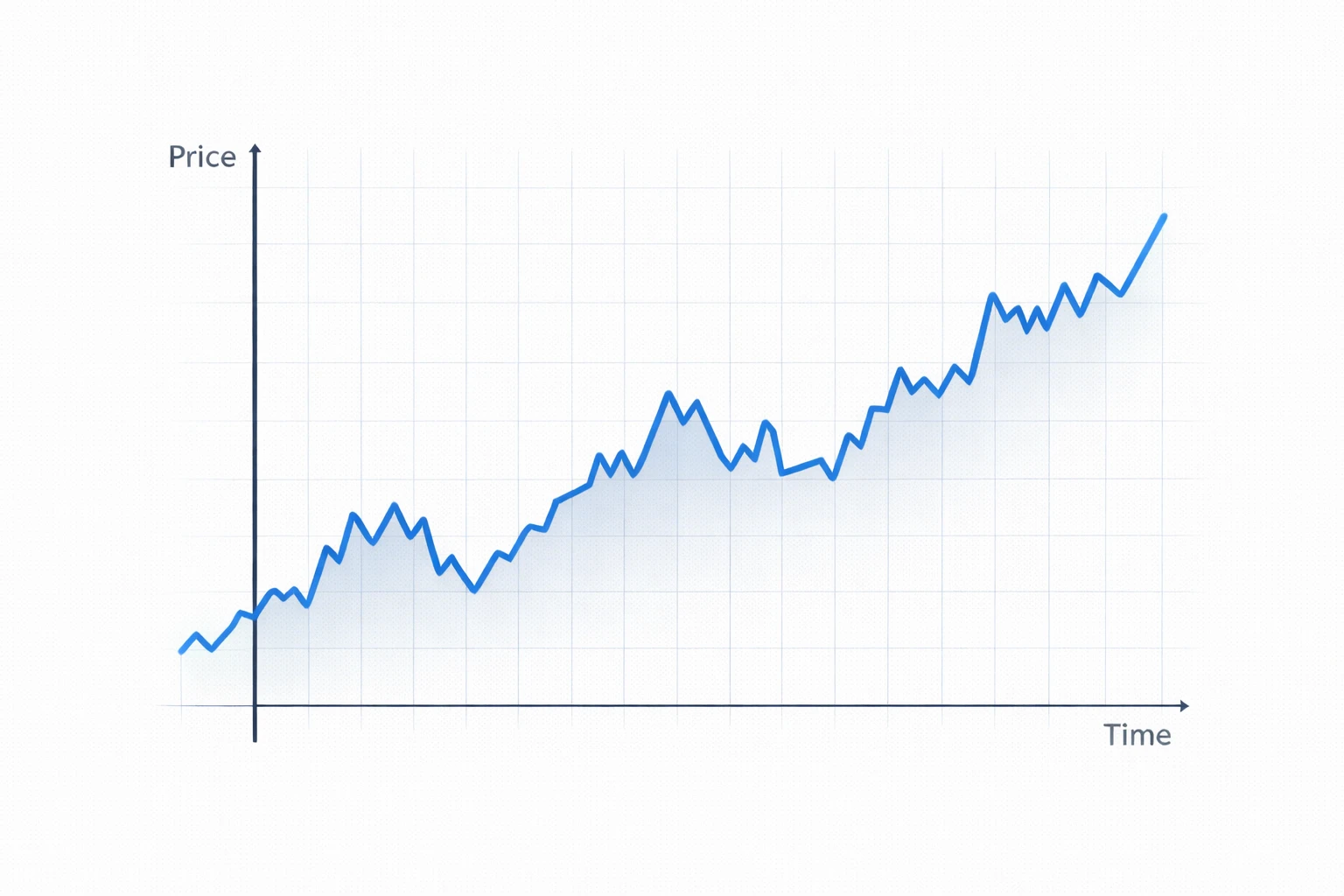
Line Chart
A line chart connects data points using a simple line.
It is often used to show how something changes over time, such as temperature changes or stock prices.
In financial markets, line charts can show the general direction of price movement.
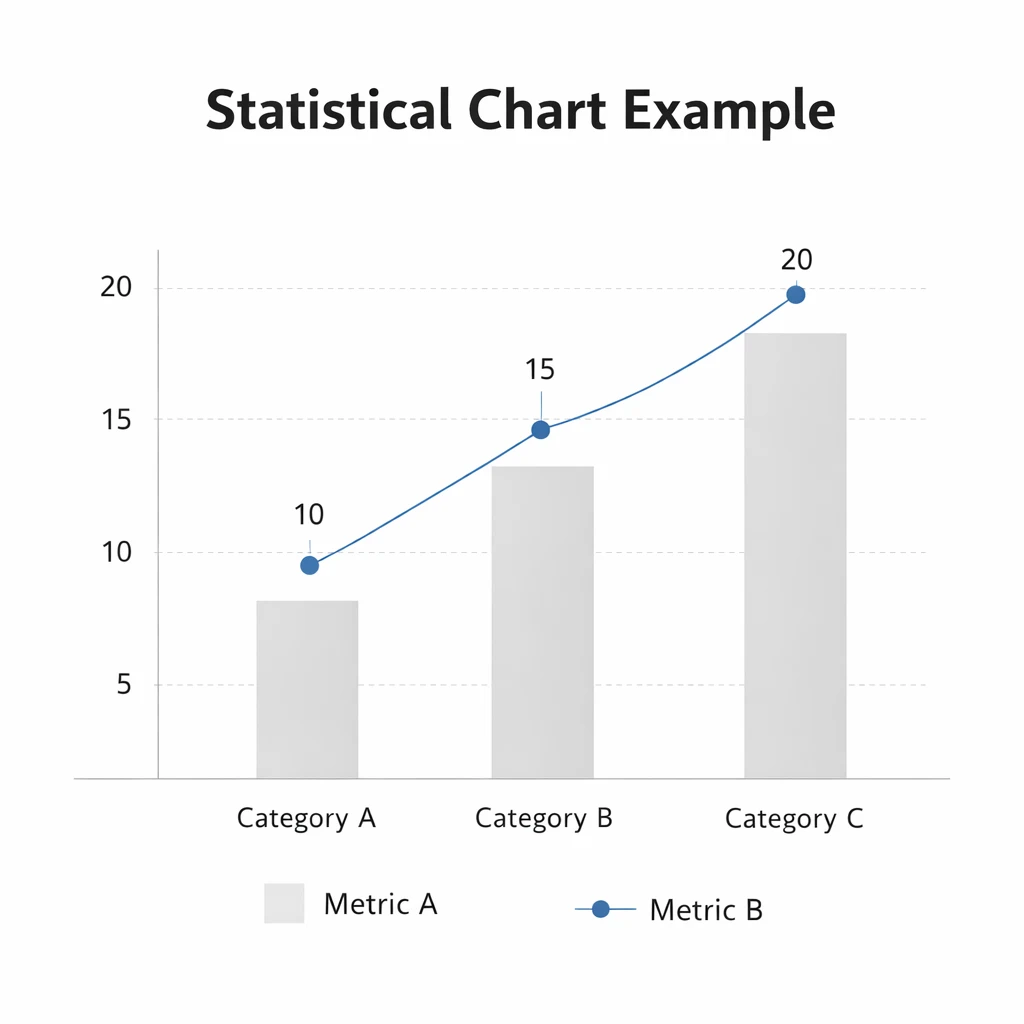
Bar Chart
A bar chart represents data using vertical or horizontal bars.
Each bar shows the value of a specific category.
Bar charts make it easy to compare different values quickly.
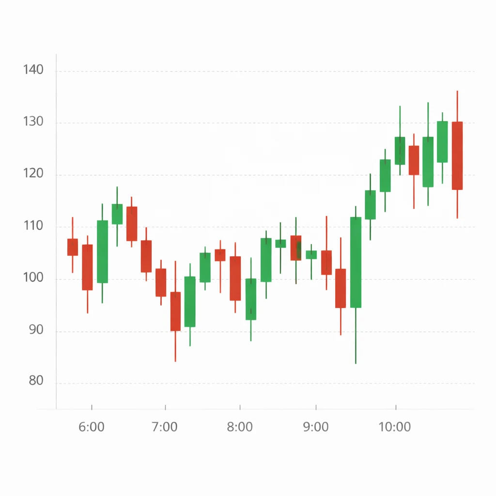
Candlestick Chart
In trading, the most popular type of chart is the candlestick chart.
Unlike simple charts, candlestick charts provide detailed information about price movement during a specific time period.
Each candle shows four important prices:
- Open price
- High price
- Low price
- Close price
This information helps traders understand market behavior, buying pressure, and selling pressure.
Why Charts Are Important in Forex Trading
Charts are important because they allow traders to analyze price movement visually.
Instead of guessing where the market might go, traders study charts to understand patterns and trends.
Charts help traders:
- Identify trends in the market
- Observe support and resistance levels
- Understand market structure
- Analyze buying and selling pressure
Without charts, trading would be much more difficult because traders would only see raw numbers instead of visual price movement.
Why Most Traders Use Candlestick Charts
Although many types of charts exist, most professional traders prefer candlestick charts.
This is because candlestick charts provide more detailed information about price movement compared to line charts.
Candlestick charts help traders see:
- Who is controlling the market — buyers or sellers
- How strong the price movement is
- Whether the market is gaining momentum or slowing down
Because of this, candlestick charts are widely used in forex trading, stock trading, and cryptocurrency markets.
What is a Candle?
A candle represents price activity during a specific time period.
For example:
- 1 minute candle
- 5 minute candle
- 1 hour candle
- 1 day candle
Each candle shows four key price levels.
These are commonly called OHLC:
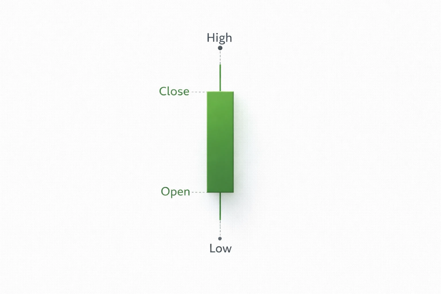
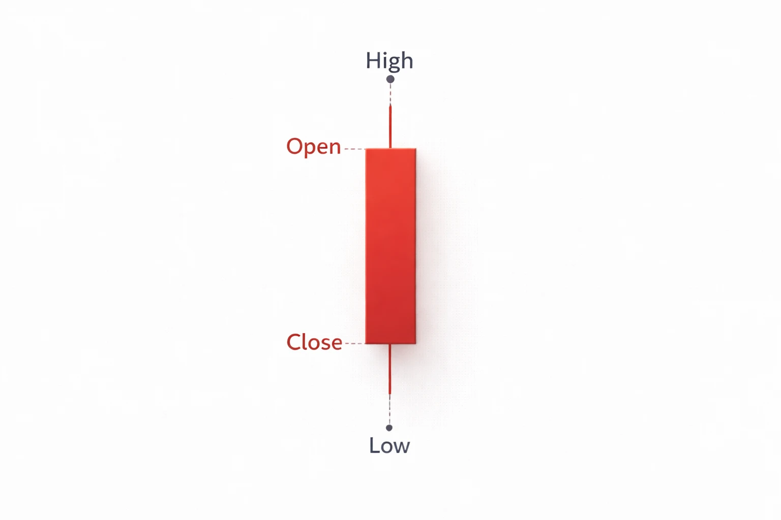
- Open – the price where the candle started
- High – the highest price reached during that time
- Low – the lowest price reached during that time
- Close – the final price when the candle finished
A candle also has two main parts:
- The body
- The wicks (or shadows)
The body represents the difference between the open and close price.
The wicks represent the highest and lowest prices reached during that time period.
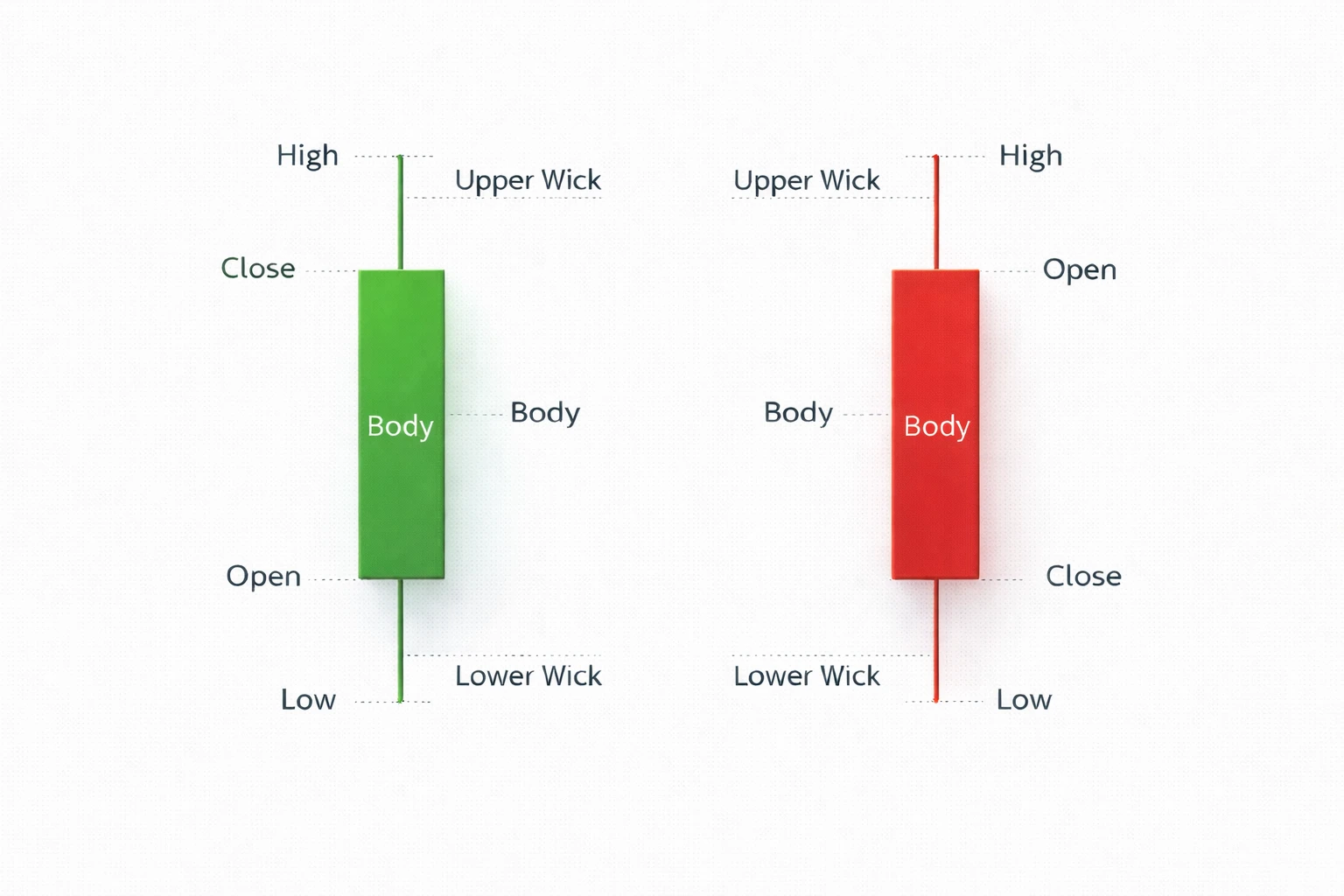
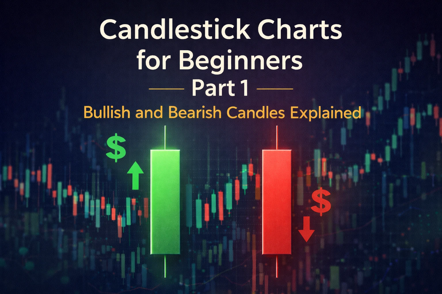
Bullish and Bearish Candles
Candles can show whether the price moved up or down during a time period.
Bullish Candle
A bullish candle means the price closed higher than it opened.
This shows that buyers were stronger than sellers during that time period.
Example:
If a 5-minute candle opens at 100 and closes at 105, the price moved upward during those five minutes.
This forms a bullish (green) candle.
This tells traders that buying pressure was stronger during that period.
Bearish Candle
A bearish candle means the price closed lower than it opened.
This shows that sellers were stronger than buyers during that time period.
Example:
If a 5-minute candle opens at 105 and closes at 100, the price moved downward.
This forms a bearish (red) candle.
This tells traders that selling pressure was stronger during that time period.
Conclusion
Understanding charts and candles is the first step toward learning technical analysis.
Charts help traders see price movement clearly, while candlesticks provide detailed information about market activity.
By learning how to read candles, traders begin to understand market behavior, buying pressure, and selling pressure.
In the next part of this chapter, we will explore more advanced candlestick patterns and how traders use them to analyze the market.

Written by
Trade Together Research
Trade Together Research is a professional market analysis team providing forex, gold, and crypto trading insights, technical analysis, and educational guides.. Learn more about our research team on the About page.